
This way to San Marco: Urban reading and vernacular signage in Venice (2016)
“The city is a discourse, and this discourse is actually a language: the city speaks to its inhabitants, we speak our city, the city where we are, simply by inhabiting it, by traversing it, by looking at it.”
Roland Barthes, The Semiotic Challenge
Reading from Above: The City as Text
Urban environments lend themselves to several types of readings, which they can enable or obstruct. One can view a city from an airplane and reach an understanding of its topography and layout. Equally, urban landscapes can be explored through images captured by remotely controlled aircrafts, whose civilian usage is increasingly popular yet problematically unregulated. Tall points in the built environment offer bird’s eye vistas of cities, providing a welcome sense of orientation and scale but obstructing the myriad complexities which characterize the city at street level.
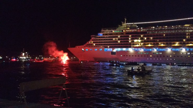
The campanili are arguably the best viewing platforms in Venice, their height only surmounted by the regular, yet dismal passing of the grandi navi through the Venetian Canal Grande, with their feeble flashes of passenger cameras. The view from the campanile of San Giorgio Maggiore enabled one of the most highly affective moments of my Venetian experience, when I realized how tiny a territory could generate such enchantment, mystery and eagerness. The permanent anxiety of so-much-to-be-seen-and-experienced could now be quantified spatially, it starts there and ends there, with a deceptive sense of clarity. The reading from above attempts to trick one into believing they are familiar with the city’s vocabulary and references, and can gain an understanding of the urban text. This alluring illusion keeps inviting visitors high up on the peaks of the city, only to reveal a totalizing perspective of an environment that was rendered fully beyond reach.

A different bird’s eye experience was enabled by the roof terrace at the Molino Stucky Hilton on the island of Giudecca, Venice to the left, and the ordinary roofs of the Giudecca residences stretching long in front of you. Giudecca, with its struggling urban fabric and lack of glamorous architectural or hospitality attractions, presents itself as little more than a series of clay roofs, burning bright under late summer sunsets for the amusement of Hilton tourists. Little do they know about Giudecca’s degrading housing stock and slowly revitalizing industrial estates, its strong community of local artists and activists and their fights for activating what they perceive to be a perished city. This reading enables no understanding of the struggles and wonders of life in Giudecca, but it can provide a context, a basis for our mental map which planner Kevin Lynch famously called “the image of the city” (Lynch 1964).


Lynch argued that appearance was crucial for the way we understand and navigate cities, and proposed that orderly and legible urban environments are essential to a pleasurable experience of the city. The easier it is to read a space and decode its configuration (ie speak its language), the more beautiful its urban environments and the more pleasurable the experience of being there – so Lynch’s argument went. At the same time, the more illegible an urban space, the more anxiety it is likely to cause, as it fails to show a planned and orderly foundation and seems to be the result of incontrollable, anonymous actions. A view from above permits the legible features of the urban environment to stand out, and therefore enables the measurement of the “legibility” or “imageability” of that environment. Standing at its top, Venice appears as little more than a finite collection of architectural gems, domes, spires and towers neatly surrounded by the waters of the lagoon. Approach it on foot though, and Venice will pose an entirely different set of challenges to its legibility and imageability.
Reading from Below: Text in the City
Venice is a city of mazes and wanders, of failing maps and disorientation. It presents itself through a richness of communicative displays, of shop signs and street names, monument identifiers and institution plaques, posters advertising art exhibitions and banners protesting tourism and cruise ships. Restaurants often display their offers on multilingual designed A-boards, house numbers map the territories of the six Venetian sestieri and the densely-clustered aerosol tagging seems more vulnerable to the elements than to any wall cleaning initiative. Traffic signs are rare and delightful to come by and the occasional memorial advertisement for recently passed parish members are sobering breaks from the visual spectacle of the surface communications of the city. Reading Venice from below entails a navigation of all these signs and markings, temporary or durable, sanctioned or not, with meanings legible for locals, tourists or neither. The city sometimes displays codes or messages that are only meant to be deciphered by construction or urban infrastructure professionals, excluding even locals from some of its inner workings.


This range of signs can be described through what semiotician Martin Krampen calls the “verbal crust” of the city, a layer of communication pertaining to the view from below and from within (Krampen 1979). The verbal crust, or the text of the city, is different from the city as text, which could be read or comprehended from above. Significantly, it also displays visual and material properties, as the verbal crust of the city always appears to us in specific forms and places. Linguist Rodrigue Landry and social psychologist Richard Bourhis took up this concept as a foundation for their semiotic theory of texts in urban spaces, which they called the linguistic landscape (Landry Bourhis 1997). Linguistic landscapes are the sum of textual inscriptions present in an urban area, which span a variety of media and languages, therefore offering an insight into urban sociology, geography and culture.
“The language of public road signs, advertising billboards, street names, place names, commercial shop signs, and public signs on government buildings combines to form the linguistic landscape of a given territory, region or urban agglomeration.” (Landry and Bourhis 1997: 25)
Reading a city from below therefore implies immersion within its unique patterns of semiotic communication, which form distinctive textual and visual environments and hold clues about urban politics and sociologies. Material surface interventions feed back into the larger cultural powers that characterize urban spaces, and are also a reliable means of access to these powers. Our right to contribute to the dominant reading of urban environments can be interpreted and measured through surface interventions. Making one’s presence apparent in the intricate dynamics of urban surfaces always depends on cultural determinants, but it also has the power of becoming a cultural determinant itself.


→ San Marco ←: The Sign Is the City
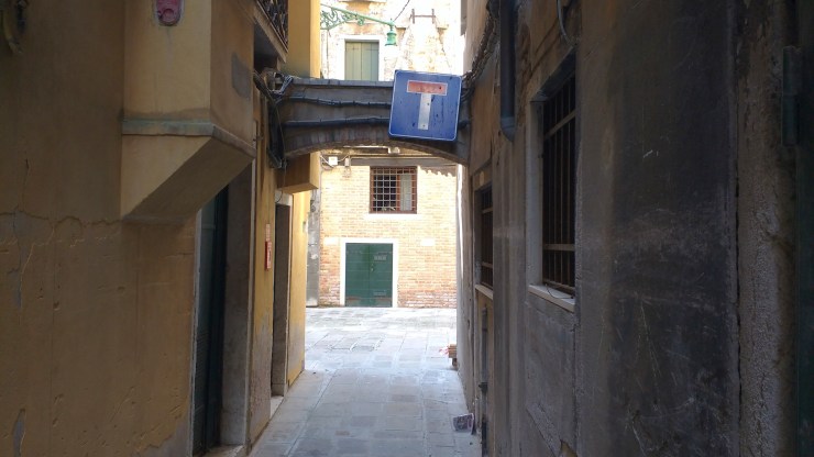
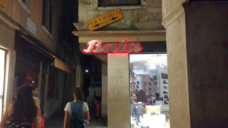
As I was photographing the linguistic landscapes and surface markings of Venice, I became increasingly aware of an entire semiotic class of hand-made directional signage, most of which is made to orientate Venetian wanderers towards the city’s main landmarks: Piazza San Marco, Ponte di Rialto, the Arsenale or the train and bus stations at Ferrovia and Piazzale Roma. While sometimes helpful for wayfinding across Venice, these signs do more than second the official yellow directional plaques: they reveal the locals’ preference for not being approached only to be asked for directions, they disseminate local geographical knowledge and they embellish the surfaces of Venice with an array of unique visual and material forms. Most of these signs are handmade, printed on paper and affixed to walls, sprayed through stencils or written directly on Venetian stones: they are as many traces of interactions with the city, and of locals taking ownership of their urban environments and shaping them for personal and collective benefit.


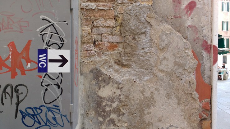
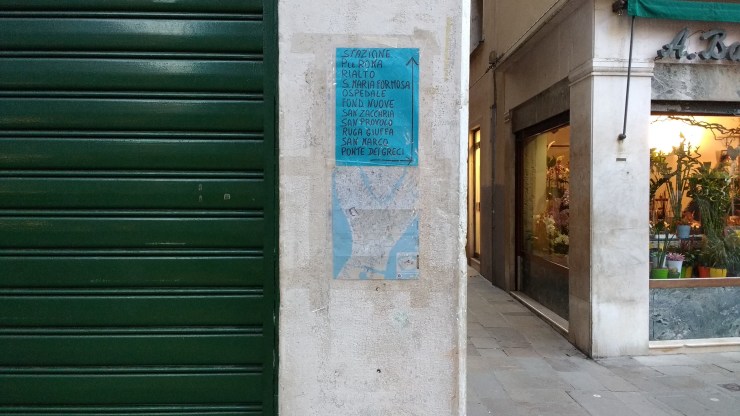
The benefit of these signs for their producers is different from that of advertising, as it does not promote or locate a commercial venue; it is different from that of street signs, as it is less guaranteed to offer reliable information and is not a sanctioned visual representation of local administration; and is different from independent markings such as graffiti writing, as its visual form is meant to be readable and points towards a common recognisable landmark, rather than an individual creative expression. Although they borrow graphic elements from each of these other categories, the hand-made directional signs constitute a distinct mode of communication in Venice. They are a form of text in the city whose production and reading do more than support urban navigation: they foster urban participation, they create a regime of written communication between locals and visitors, and they provide material evidence for a living, continuing interest in the city. People engage in the production of these signs independently, yet they form a collective feature of Venetian surfaces, and they contribute to defining its culture.


***
Reading cities can be both a process of production and contemplation, of zooming in and out to focus on particular places, stories or images. Starting with impressions from two bird’s eye Venetian vistas, from the campanile of San Giorgio Maggiore and the rooftop terrace of the Stucky Molino Hilton, this essay then presented ground level photographic observations of surface signage and communication, together with an image collection of Venice’s unique vernacular directional signs. The orderly narrative of Venice seen from above became significantly entangled when read from below, navigating its rami and fondamente and deciphering its layered linguistic landscape. Urban readings were traced from engaging with the city as text to engaging with text in the city, both of which were illustrated in annotated photographs that capture these different modes of seeing and reading.
Urban surface signs are not just mediators for the identity of a city, but they form an intrinsic part of that identity, both materially and culturally. Independently produced, vernacular signs are all the more interesting because they reflect people’s direct engagement with the city through very specific and unique means of expression. Discovering and documenting Venetian street signs has been central to my reading and understanding of the city, and it has offered numerous moments of unexpected diversity and joy in my daily urban wanders. Moreover, it has directly informed my image of Venice, which I now picture through its surface signage as much as I do through its geographies, smells and atmospheres. The verbal crust of the city is also visual, material and territorial. The signs of Venice are the city.

References
Roland Barthes, The Semiotic Challenge, Oxford: Basil Blackwell, 1988: 195
Martin Krampen, ‘Meaning in the Urban Environment’, Research in Planning and Design (5), London: Pion, 1979
Rodrigue Landry and Richard Bourhis, ‘Linguistic Landscape and Ethnolinguistic Vitality: An Empirical Study’, Journal of Language and Social Psychology (16), no. 1, 1997
Kevin Lynch, The Image of the City, Cambridge, Mass; London: MIT Press, 1960
